Improving Participant Intake Across WHOOP Labs

WHOOP Labs HQ, Boston.
Staff Were Running Three Tools at Once.
WHOOP Labs ran participant studies across multiple tools with no unified intake flow. Front-of-house (FOH) staff, coordinators, and participants were all absorbing friction that had built up quietly — too many tabs, unclear handoffs, administrative work landing in the wrong hands.
The immediate trigger was a new WHOOP Labs location opening in Doha. We needed an intake system that could work there from day one — which meant building something intentional rather than porting over what Boston had. And since we were rebuilding it anyway, we revamped Boston at the same time to create alignment between both locations. I was the sole designer, responsible for the system end to end — from the moment a participant walks in to the moment they leave.
The Problem Was Bigger Than Too Many Tabs.
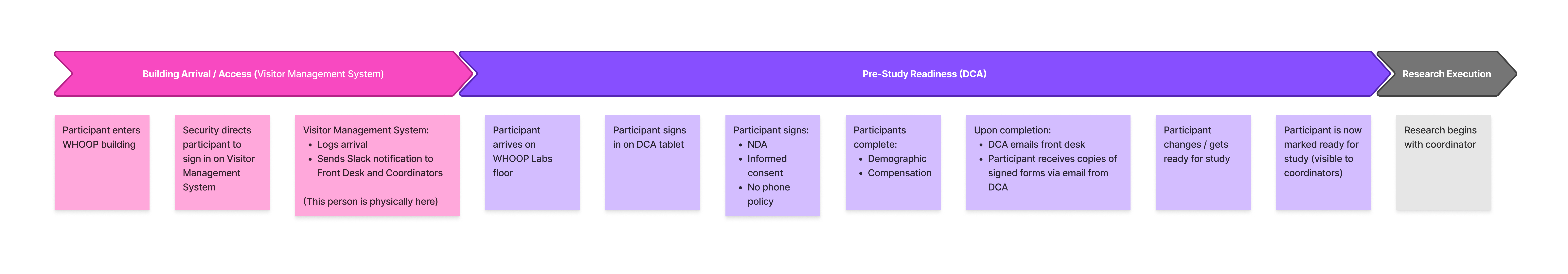
Before designing anything, I mapped the full intake process from arrival to exit. I needed to understand what was actually happening — who touched the experience, where information was collected, where handoffs broke down, and where staff had built workarounds just to keep the day moving.
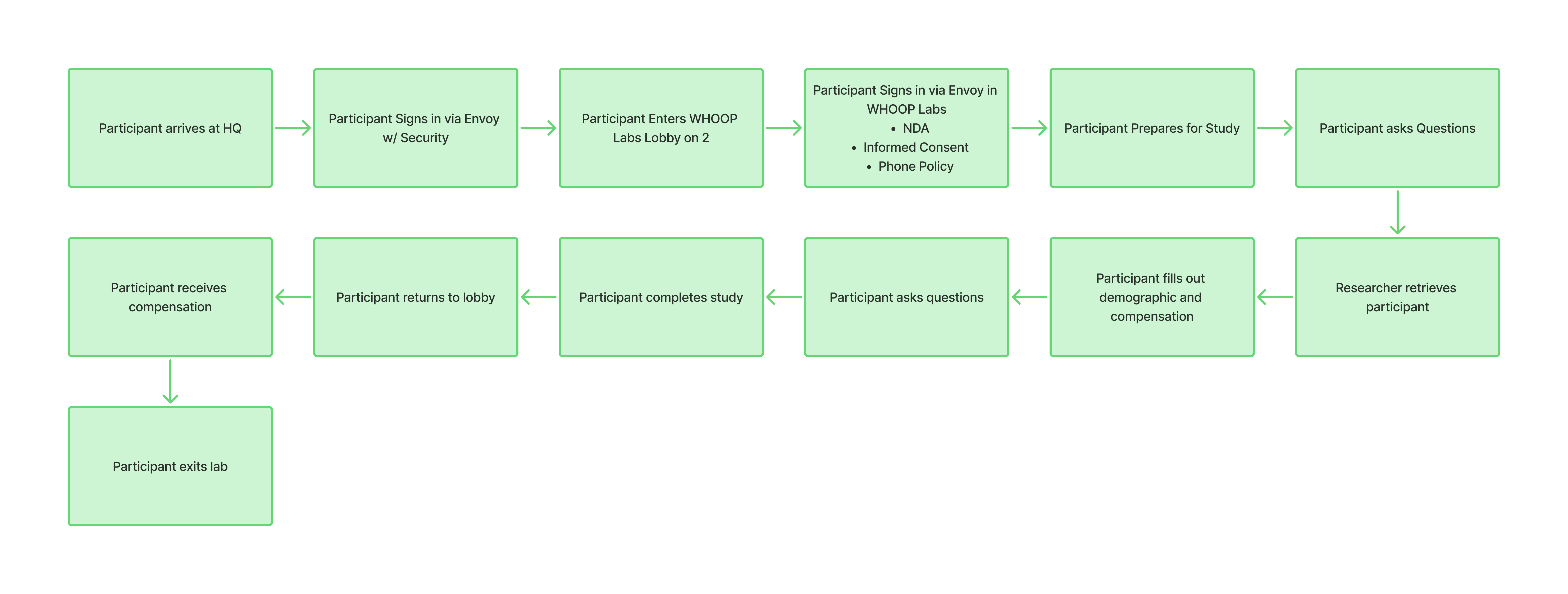
End-to-end participant flow — from arrival at HQ through study completion and compensation.
Then I layered in a service blueprint to separate what participants experienced from what was happening behind the scenes. What it revealed wasn't a UI problem — it was systemic. Tools that didn't talk to each other, manual steps filling the gaps, workarounds that had quietly become standard practice. This wasn't a "build a nice app" project. It required addressing the system before touching the screens.
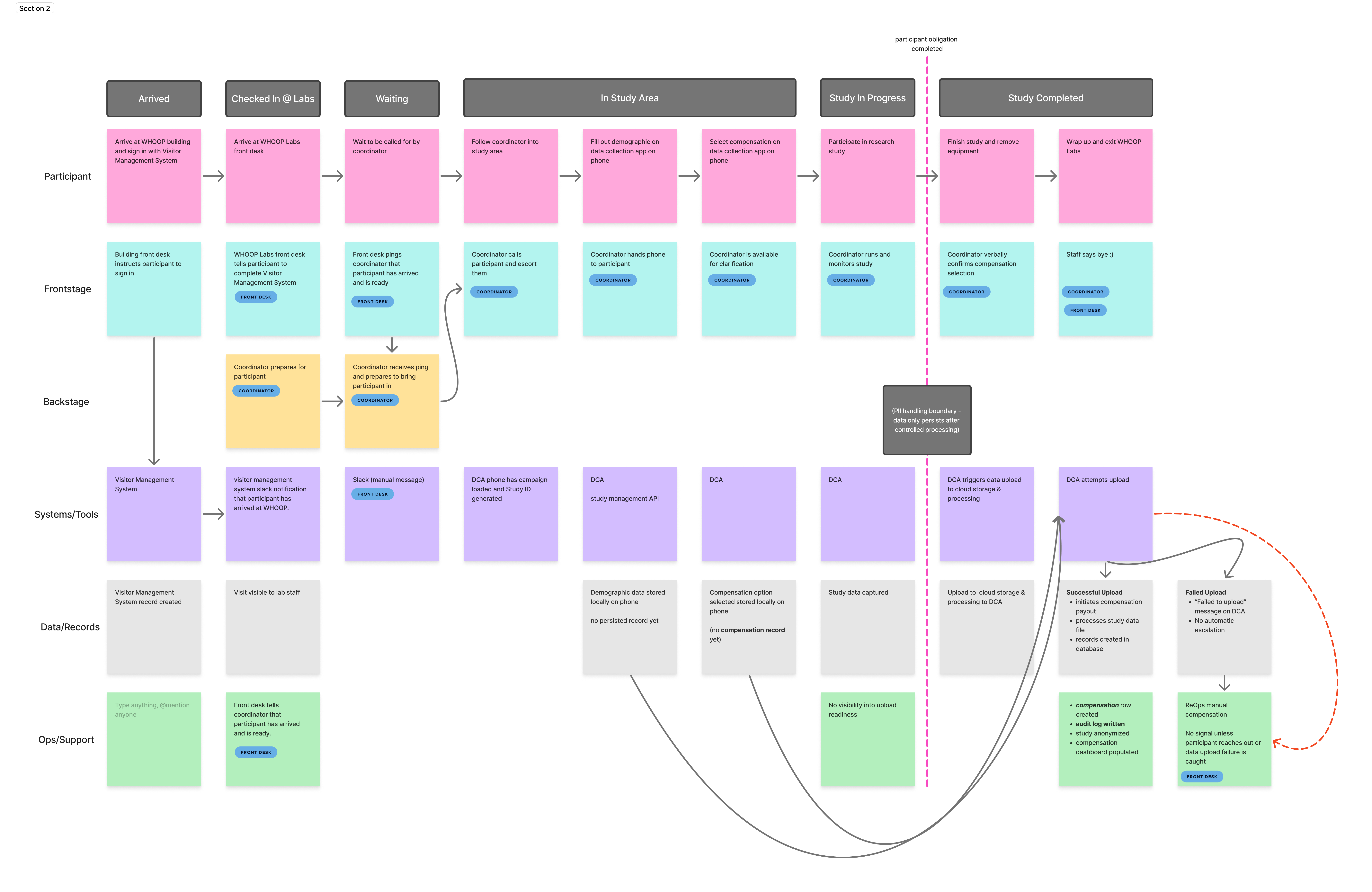
Service blueprint mapping frontstage participant actions against backstage staff actions, systems, and data dependencies.
Participant Records Were Tied to the Wrong Process.
The blueprint revealed something structural. Participant demographic and compensation records were bundled inside the study data upload — the data file submitted to the research system after each session — which meant if the upload failed, staff could lose access to the information they needed to check in, route, and compensate participants.
The problem was easy to miss in the moment. Staff might not catch a missing record until late in the day, after the participant had already moved through the study. By then, it was messy to fix.
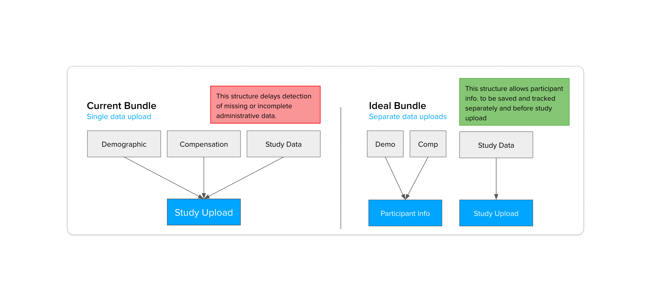
Current Bundle (left) ties demographic, compensation, and study data to a single upload. Ideal Bundle (right) separates participant records so they can be saved independently.
The fix was to separate them. Demographic and compensation records would be saved before the study upload — independently, earlier, with their own confirmation. Study data could still fail without taking participant records down with it.
Administrative Work Was Happening in the Wrong Place.
The most consequential shift wasn't a UI change — it was a spatial one. In the current flow, participants completed forms, demographics, and compensation selection after entering the study area. That meant coordinators had to walk participants through administrative steps before any actual research could begin.
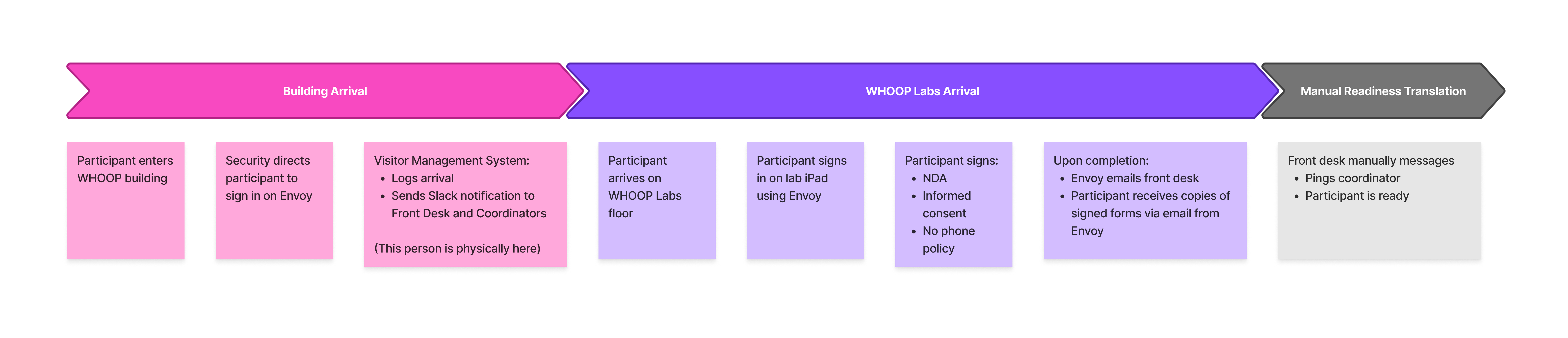
Current flow — demographic and compensation steps happening inside the study area, on a coordinator-managed device.
The decision was to move all of that earlier — into the lobby, before participants are ever called in. FOH owns the check-in experience. Coordinators own the study. Clean separation, no overlap.
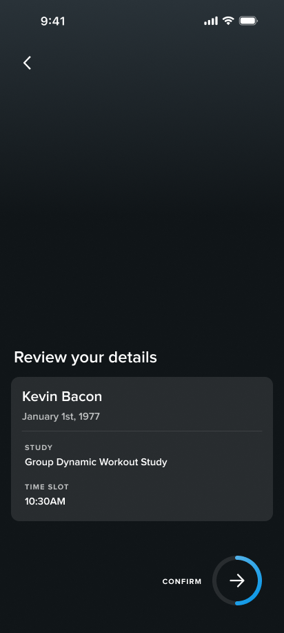
Future flow — participants complete check-in, demographics, and compensation selection in the lobby before being called in, on a device handed to them on arrival.
The goal was a seamless transition between spaces. By the time a participant is called in, admin is done — they move directly from the lobby into their study session without any interruption. No paperwork mid-session, no coordinator switching hats.
The Check-In Model Needed to Change.
The original lobby concept had participants checking in at iPads bolted to the front desk. That solved check-in as a technical problem, but missed the experience — participants were standing at a counter, completing forms in place before being moved along.

WHOOP Labs lobby, Boston — the original check-in setup with iPads fixed at the front desk.
The bigger issue was ownership. Participants had to remember which study they'd signed up for — often pulling up old messages just to check in. First-timers faced a wall of forms with no real explanation of what was being asked or why. In the new flow, that burden shifted to us — a participant enters their name and date of birth, and their profile and session pull up automatically.
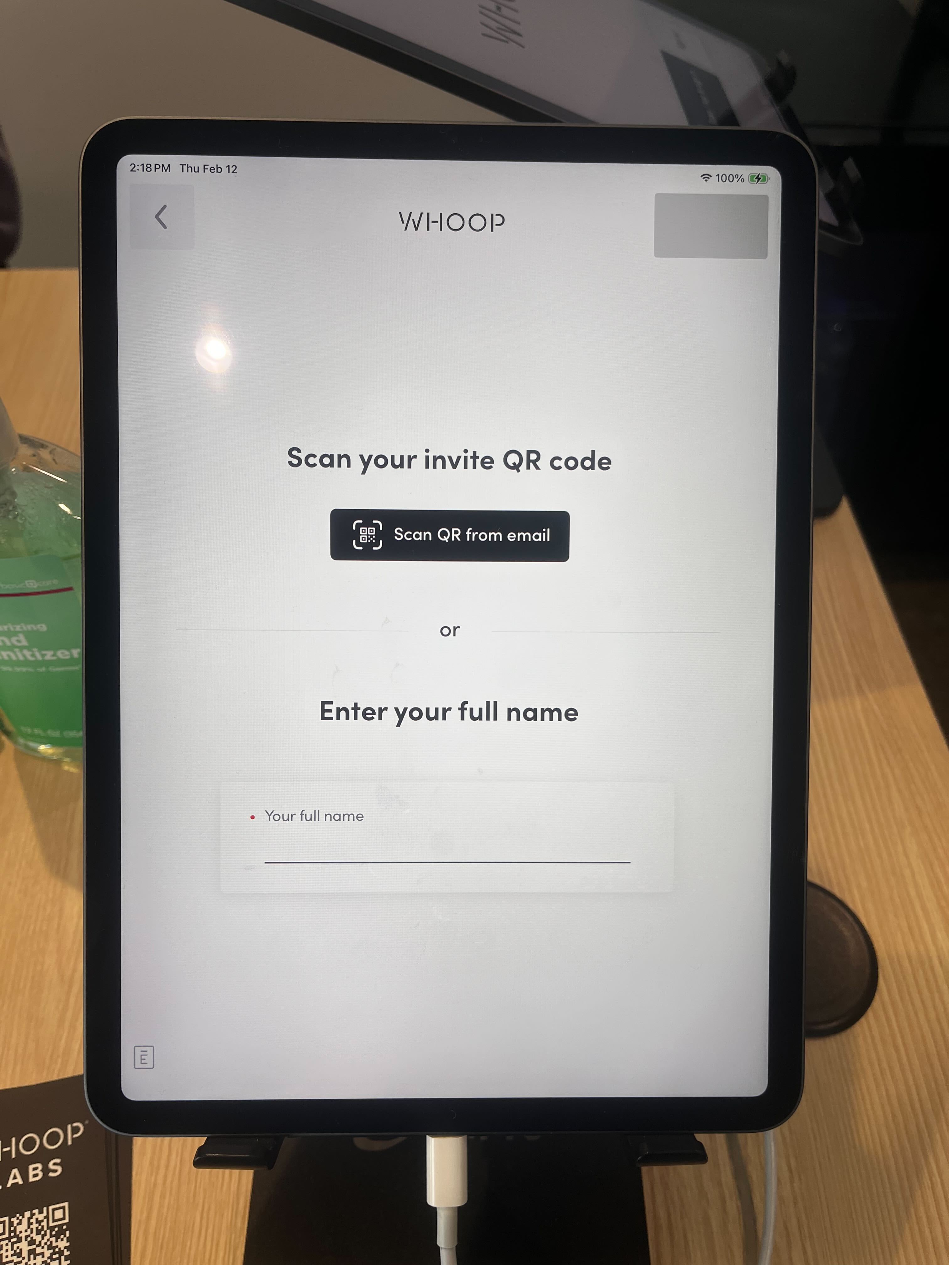
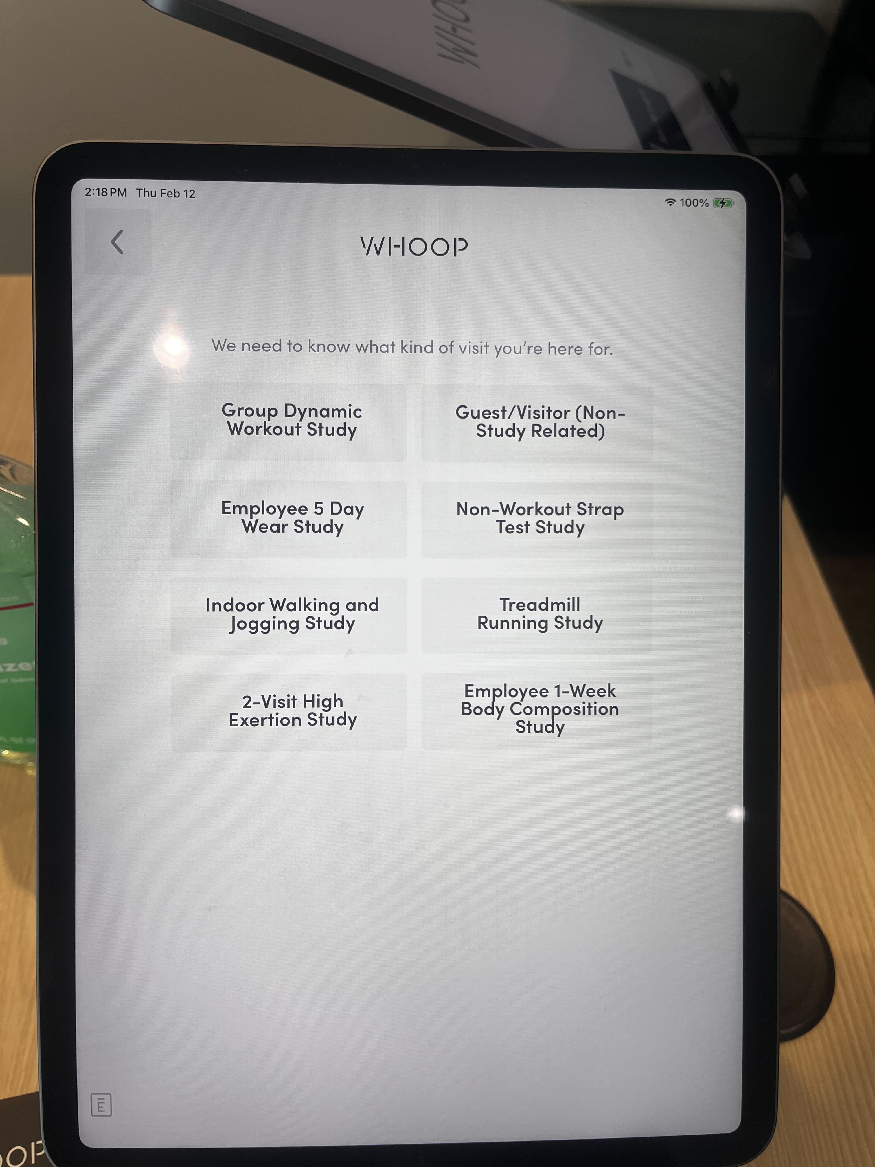
Original visitor management system — participants identified themselves and selected their study visit reason on arrival.
The original concept used iPads fixed at the front desk — but the DCA app is Android only, which made that a non-starter. Switching to Android devices that staff could hand off on arrival ended up being the better solution anyway. Participants could sit down, take their time, and move through check-in, demographics, and compensation selection at their own pace — all before being called in. A constraint that pointed us toward a better experience.
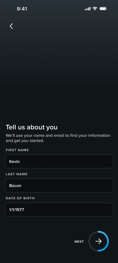
New lobby intake screens — participants enter their name and date of birth to pull up their profile and session.
Coordinators Were Doing Two Jobs at Once.
Before, coordinators weren't just running studies — they were absorbing whatever the intake flow hadn't handled. Helping participants finish forms, switching between demographic and compensation screens, catching errors that the lobby flow now handles before a participant ever reaches the study area. The problem was that coordinators aren't subject matter experts in compensation or demographics — that's not their role, and being put in that position created friction for everyone.
The feedback after the redesign was clear: coordinators valued being able to focus solely on data collection and actually interfacing with participants — the work they were hired to do. The future flow gave them one job: see who's ready, confirm the session, start the study.
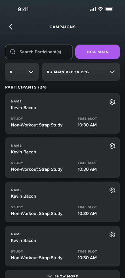
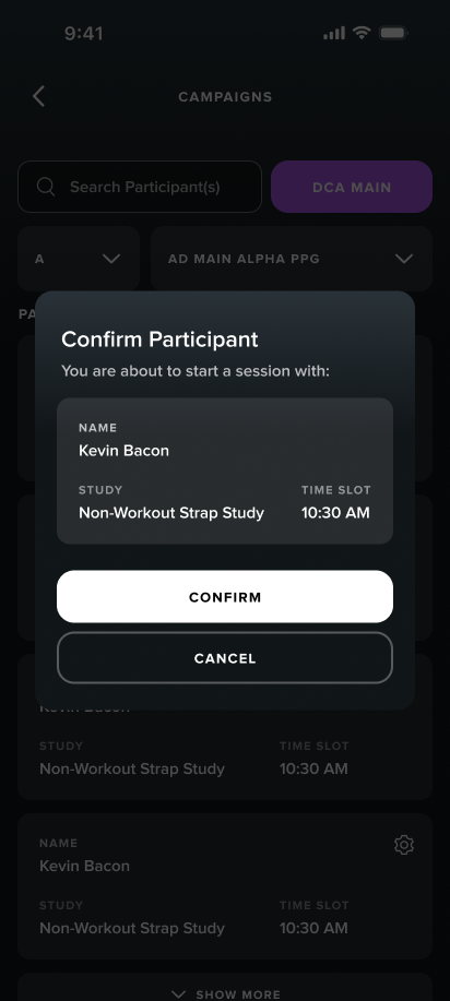
Redesigned coordinator view — participants listed with session details, ready to confirm and begin.
The Right Tool Wasn't Always Figma.
The FOH dashboard ran on an older internal web design system with no Figma library — rebuilding that component set would have taken weeks and still wouldn't have accurately reflected the real product. So I designed it in code instead.
I partnered with engineering to get set up directly in their repo. Working inside the real product environment meant I was designing against actual components and real states — not approximating them in Figma. Because the dashboard handled participant PII, I built a mock backend so AI tools never touched sensitive records.
The Dashboard Answered the Wrong Questions.
The compensation dashboard already existed — it just wasn't the only tool FOH was using. Records, history, and study details lived across multiple places, which meant answering a simple participant question required opening three to five different tools. The goal was to make this the single source of truth.
"How many points do I have?"
"What was the last study I came in for?"
"Can I change what I chose for compensation?"
Two decisions shaped the redesign: replacing the calendar view with a scannable list format, and consolidating participant information onto a single profile page — points balance, compensation history, study visits, all in one place.
Original compensation dashboard — built around the data model, not the day-to-day FOH workflow.
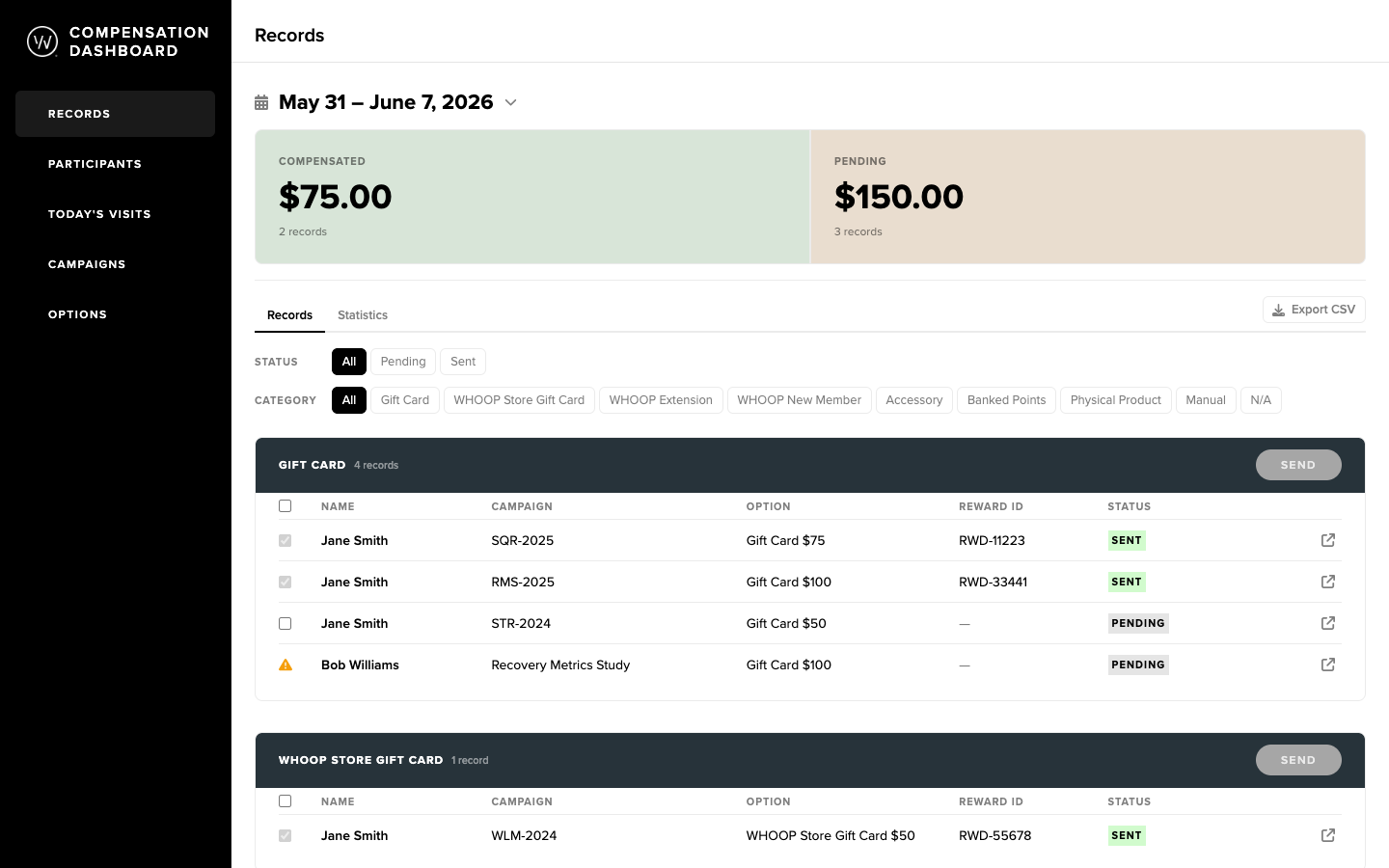
Redesigned dashboard — organized around the questions FOH actually needs answered during a study day.
The System Is Now in Build.
Handoff included Figma files for the lobby and coordinator experiences, a coded prototype of the compensation dashboard on its own repo branch, and design documentation and specs for the engineering team. Engineering is currently in implementation — expected to go live in Q3 at WHOOP Labs Doha.
Tooling and Operations Have to Be Evaluated Together.
You can't redesign a tool without understanding the operational flow it lives inside. The dashboard wasn't broken because of bad UI choices — it was broken because the workflow had never been designed as a system. The same was true for participants: confusion at check-in wasn't a UX failure, it was a signal that the system had put the wrong burden on the wrong person.
Designing in code pushed me into the same environment as the engineers — same problems, same language. But the broader lesson was simpler: work is easier and the outcomes are better when you're working closely with engineers, PMs, and stakeholders instead of at arm's length. One of the clearest examples was the decision to go AI-native for the dashboard. Getting early buy-in from engineering meant we could move faster, design against real states, and show stakeholders a live prototype instead of static Figma screens. That kind of decision doesn't happen at the end of a handoff — it happens when everyone's already in the room.