Reducing Participant Onboarding Friction in WHOOP Labs
A Visual Refresh That Became a Lot More.
My first project at WHOOP was scoped as a visual redesign of the Data Collection App (DCA) — the Android app participants use to complete onboarding before every study. After observing sessions in the lab, I reframed the brief. The problem wasn't visual. It was structural — participants couldn't get through onboarding without a coordinator standing next to them, and coordinators were already stretched thin.
What shipped was a redesigned onboarding flow built on progressive disclosure, a compensation experience that turned dropdowns into a proper browsing interface, a full Arabic localization for the Doha launch, and a design system foundation that brought the WHOOP DS into the DCA for the first time — currently in development and expected to go live at WHOOP Labs Doha in Q3.
The App Worked. It Just Needed a Person Next to It.
Onboarding moved participants through check-in, demographics, and compensation before a study could begin. Returning participants moved through in 45 seconds to a minute. First-time and early participants took up to two and a half.
The time wasn't the issue. What happened during those minutes was. The DCA was built entirely on boilerplate Android components — no context, no guidance, no explanation of what was being asked or why. The interface assumed participants already knew what they were doing — and gave them nothing when they didn't.
Original DCA onboarding — boilerplate Android components with no contextual guidance.
The Same Questions Came Up Every Time.
I spent time observing onboarding sessions across study days. The pattern was consistent — participants would stall, look around, and wait for a coordinator to come by. Coordinators were managing multiple participants at once, so a participant stuck mid-form could be waiting several minutes before getting help. The interface gave them nothing to work with in the meantime.
"What do points mean?"
"How active do I need to be to pick a 3?"
"What skin tone am I?"
"Can I change my compensation later?"
Even entering a birthday was a recurring frustration. The experience wasn't broken — it just worked best when someone was standing next to the participant explaining it. With roughly 50 participants moving through the lab each day, coordinators couldn't be everywhere at once.
One Long Form Was the Wrong Mental Model.
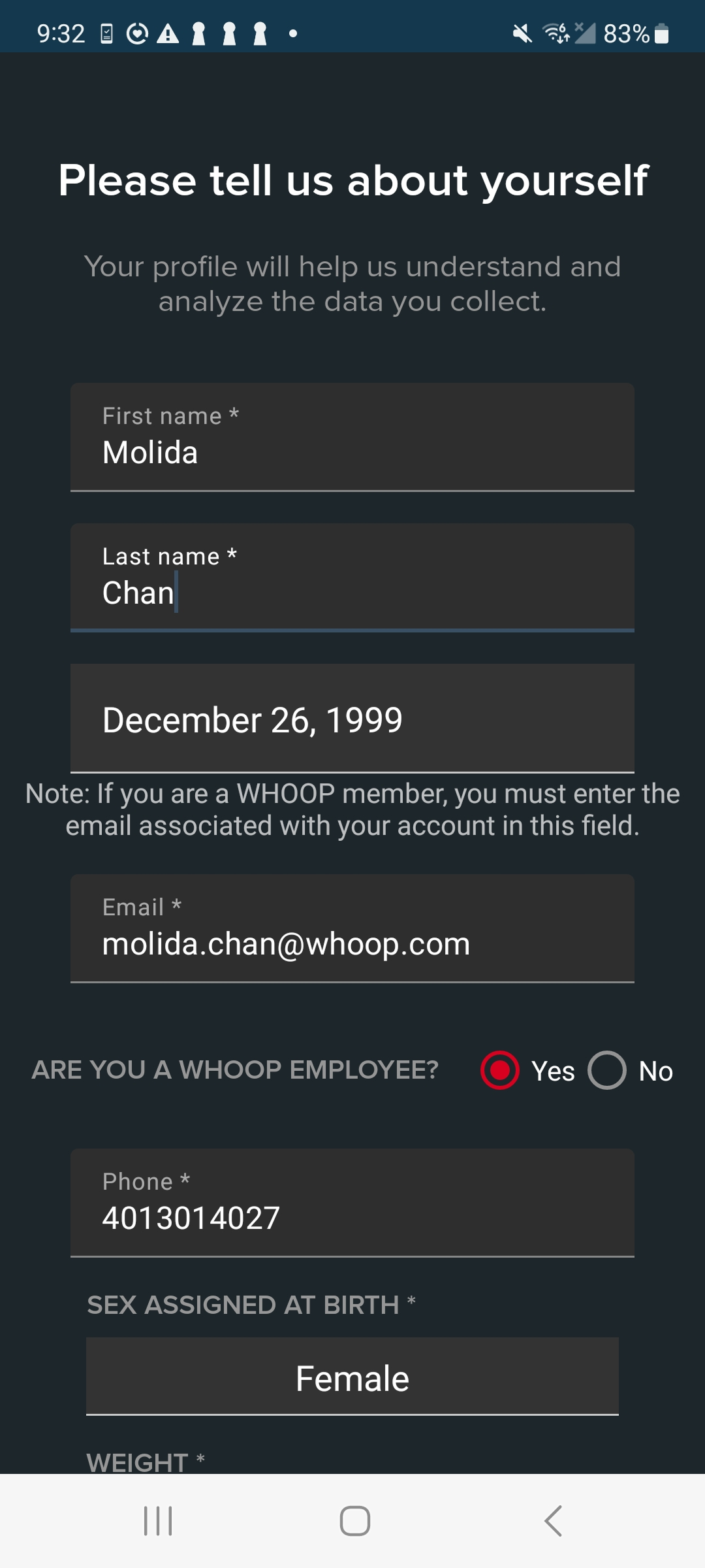
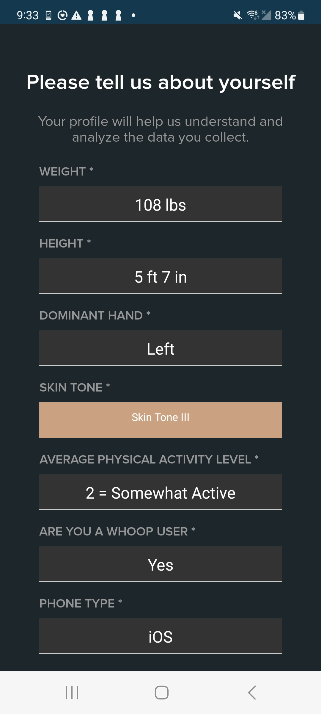
The original demographic experience asked participants for everything at once. Personal information, physical measurements, ethnicity, skin tone, and activity levels all lived inside a single scrolling form. There was no sense of progress, no sequencing, no scaffolding.
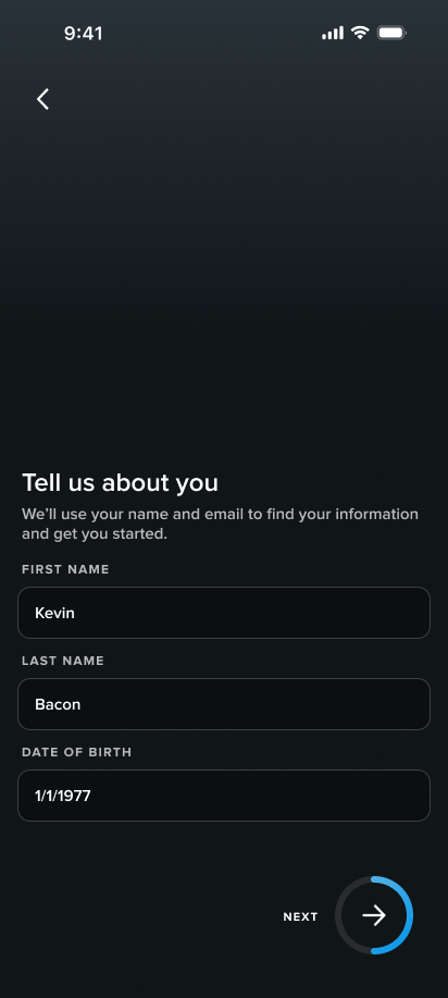
The redesign applied progressive disclosure — breaking onboarding into a sequence of steps ordered by cognitive load. Participants started with what they already knew — name, date of birth, contact details. Questions that required more interpretation, context, or explanation came later, after participants had already established a rhythm.
Original single-form approach (left) vs. redesigned step-by-step flow (right).
Small Problems, Specific Fixes.
Restructuring the flow solved the sequencing problem. But several individual questions had specific friction of their own — each one required a targeted fix.
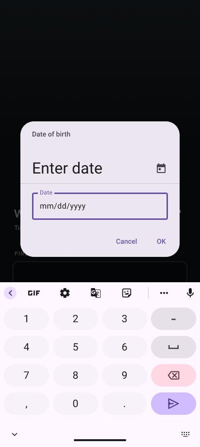
Date of Birth
The existing Android date picker required participants to scroll through months, days, and years separately to land on their birth date. Rather than replacing the component entirely, I modified the interaction to support direct text entry — a faster fix that worked within existing technical constraints without requiring a full component swap.
Navigate through months by tapping the back and next arrows.
Navigate through years by tapping the dropdown.
Source: Material Design 2 — m2.material.io
Redesigned date of birth field — participants type directly instead of scrolling.
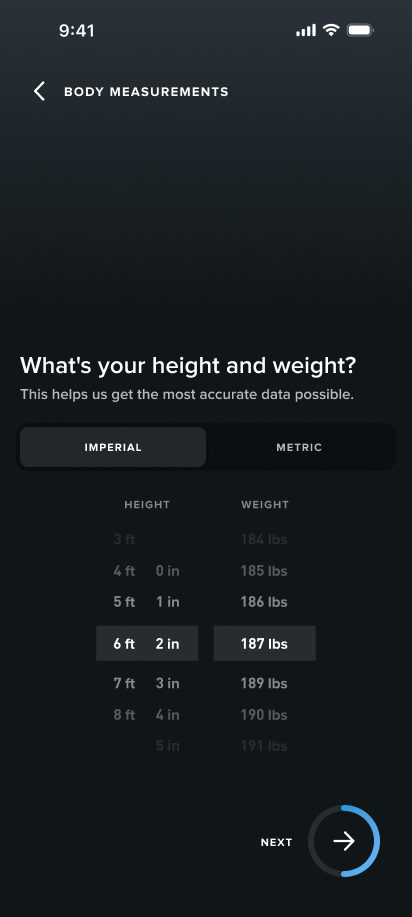
Measurements
The original flow only supported imperial measurements. Participants who used metric had to convert on the spot — and when they couldn't, coordinators were pulling out their phones to do it for them. The redesign introduced support for both systems so participants could enter what they knew without anyone having to stop and calculate.
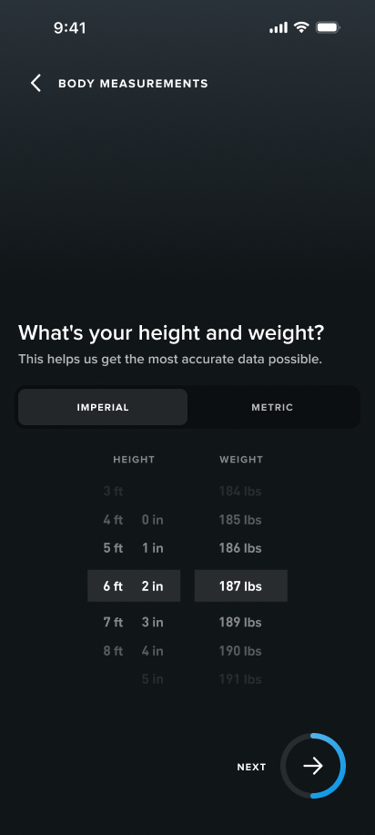
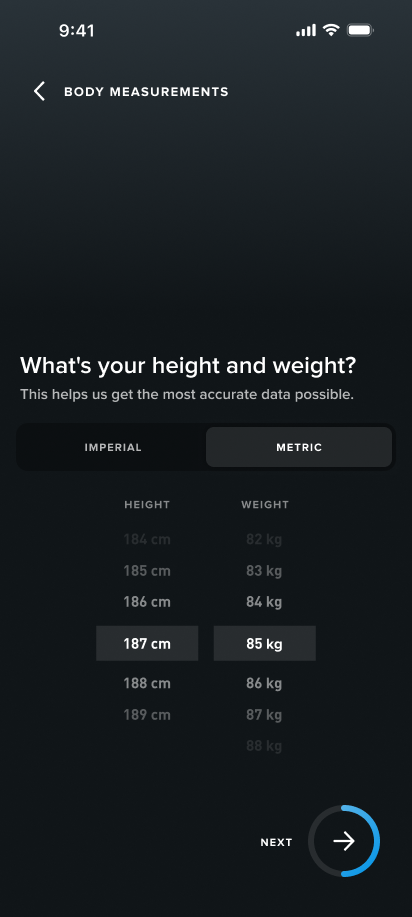
Imperial and metric measurement options — participants choose the system they already use.
Activity Level
Activity level was one of the questions coordinators got asked most often. Participants were asked to rate themselves on a numbered scale with no context for what each number meant — broad enough that almost any answer felt wrong. The redesign replaced the scale with plain descriptions and real examples so participants could identify where they fit on their own.
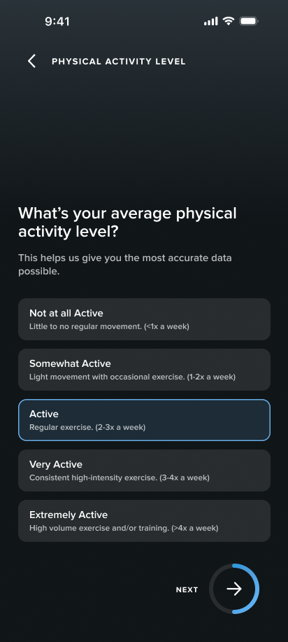
Redesigned activity level — clear descriptions replace numbered ratings.
Skin Tone
Participants weren't confused by the question — they were confused by how to answer it. The original screen asked for a Fitzpatrick skin type with no visual reference and no explanation of why it was being collected. The redesign added visual swatches, supporting descriptions, and context about why the information mattered.
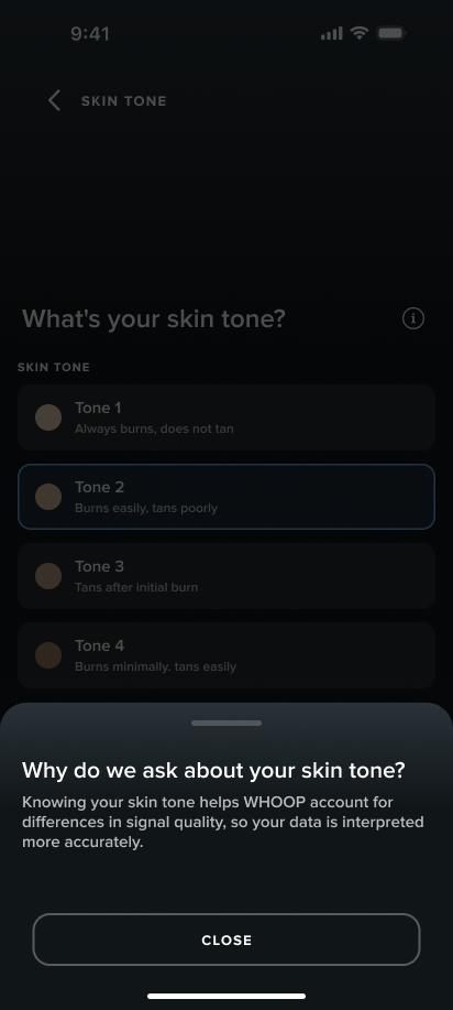
Original (left) — swatches with no context. Redesigned (right) — explanation of why the question is asked before selection.
Review
Before moving to compensation, participants reviewed everything they'd entered. It's a small addition but it does something important — it gives participants a moment to catch errors themselves rather than discovering them later when it's harder to fix. It also gives them a sense of agency over their own information before the session begins.
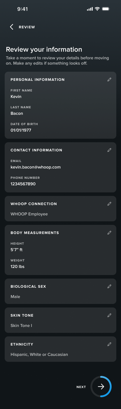
Review screen — participants verify their entries before proceeding to compensation.
Compensation Needed to Explain Itself.
The compensation system was simple: participants earned points and redeemed them for rewards. The original interface didn't communicate any of that. One unclear summary screen, then a series of dropdowns. No context, no browsing, just form fields. Most participants had already forgotten what they were told at check-in by the time they got there.
"How much are my points worth?"
"Can I save them for later?"
"Can I change what I chose?"
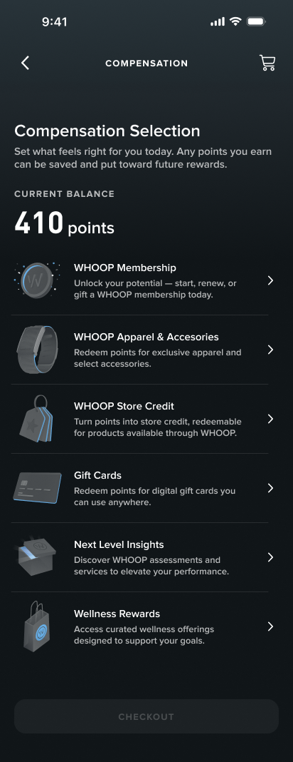
The redesign gave participants a clear balance summary first — what they earned, what changed, what they had. Then a proper browsing experience: gift cards, wellness rewards, WHOOP store credit. Something they could navigate on their own.
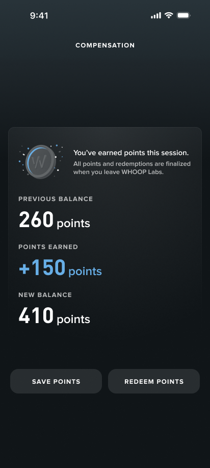
Points summary (left) gives participants context before they choose how to redeem.
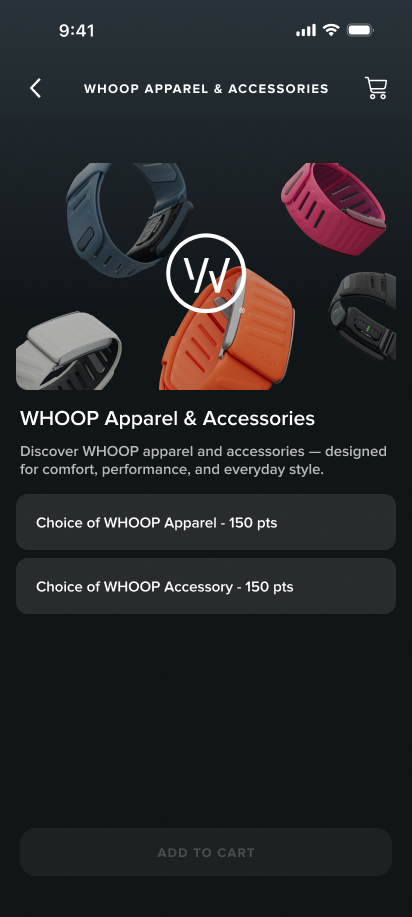
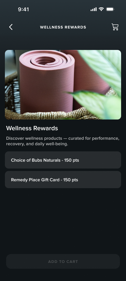
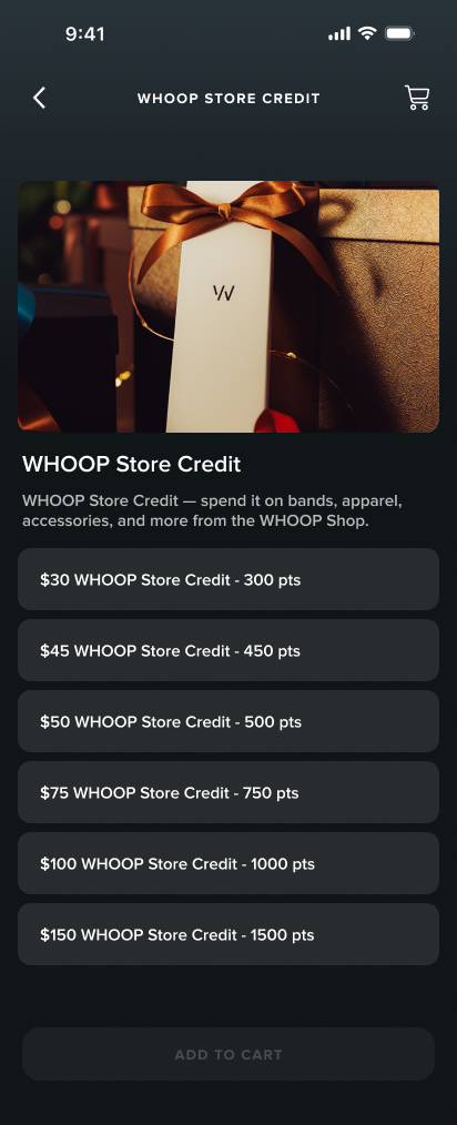
Redesigned reward categories — organized and browsable once participants understand their balance.
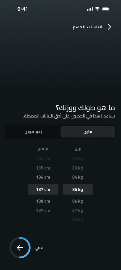
Arabic Wasn't an Afterthought — It Was Happening in Parallel.
The Doha launch required a fully localized Arabic version of the DCA, and I was the only person working on it. No existing RTL support in the design system, no Arabic design precedent at WHOOP to pull from. The layout work was more than mirroring — flipping to RTL meant auditing every screen for directional assumptions. Text alignment, icon orientation, navigation flow, input fields. Some assets needed to flip with the layout. Others, like logos and certain icons, needed to stay fixed. Arabic script also behaves differently at scale — strings that fit cleanly in English could overflow or collapse in Arabic, so I tested every screen at realistic string lengths and adjusted layouts to handle the range.
Content decisions required their own research. The Doha context meant certain question framing needed to change — gender options, for example, don't include intersex in that context. I investigated what was culturally appropriate rather than assuming a direct translation would work. Font licensing was also unresolved — the DCA typeface didn't have Arabic coverage, so I had to identify a compatible Arabic typeface, verify licensing, and get it approved before any of the designs could move forward.
English
Arabic
Body measurements — layout, text direction, and toggle position all flipped for RTL.
The DCA Needed to Feel Like WHOOP.
The DCA had always existed outside WHOOP's design ecosystem, built entirely on Android Material components with no connection to the WHOOP Design System. I advocated for changing that as part of this project — but it was a bigger lift than a visual refresh, and there was pushback.
Getting buy-in meant three different conversations. With my PM, I made the case around future velocity: every Labs project after this one would benefit. With the design system designer, I focused on ecosystem consistency and brought them in directly to help bridge component gaps. With engineering, I was honest about the tradeoff and made the case for why the long-term payoff was worth it.
Not every WHOOP component had a direct Android equivalent and some patterns had to stay in place — the date picker was one. But the foundation is established. Future DCA work won't have to start from scratch.
The Problem Was Never the Interface.
I was handed this project as a visual redesign. After spending time with participants and coordinators, it was clear that polishing the UI wouldn't solve anything. The friction was coming from how information was organized, sequenced, and explained — not how it looked. Identifying that early changed the entire scope of the project.
What started as a visual refresh grew into a full onboarding redesign, an Arabic localization, and a design system migration — none of which were in the original brief. It felt like a lot at the time. But each piece had a clear reason to exist, and working through them one at a time made it manageable. By the end, the scope that felt overwhelming at the start was just the project.